
Voxcells
The 3D Pocket Builder
iOS - 2022

Role :
Lead Designer
Tools :
Figma, Blender
Duration :
4 months
Spriteley is a Berkeley-based start-up with the intention of translating 3D tools like Blender and Maya into a mobile space. I was brought onboard to research and design a dashboard to demonstrate some of the early voxel editing tools they had created.
The challenge
What does a 3D mobile editor look like?
While there are many mobile apps that support 2D artists, such as pocket versions of many Adobe products and more generalized tools for photo editing, there are hardly any that support 3D art.
In the past, this was mainly due to limited processing power and the overall lack of a market. However, in recent years, mobile devices have seen significant improvement in terms of performance and memory, and 3D art has become one of the most dominant mediums.
This is where Spriteley comes into the picture. Their goal is to make 3D art more accessible to current and aspiring 3D artists. In this case study I tell the story of the process that my team went through to develop one of the first voxel-based builders for iOS.

Understanding voxels
Why 3D art relies on Voxels
3D art relies on voxels because voxels are the best way to represent 3D objects in a digital format. A voxel is a volumetric pixel, similar to a 2D pixel but with a third dimension of depth. This allows for more detailed and accurate representation of 3D shapes and forms, particularly for 3D models that have a lot of small, complex details.
Voxel-based 3D art also allows for more flexibility and control in the creation process, as voxels can be edited and sculpted like clay, allowing for more organic and natural-looking shapes. Voxel-based 3D art also allows for more efficient rendering and real-time manipulation of 3D models, particularly in games and interactive applications.
Voxel-based 3D art also allows for more flexibility and control in the creation process, as voxels can be edited and sculpted like clay, allowing for more organic and natural-looking shapes. Voxel-based 3D art also allows for more efficient rendering and real-time manipulation of 3D models, particularly in games and interactive applications.

Main MVP
The three engines
The first three tools of the Spriteley builder had been built before I joined the team. These were rotate, brush, and blocks.
The goal at this stage was to develop the best possible layout for these tools to live in, to develop a dashboard that was self explanatory enough to live comfortably within the iOS ecosystem. Though only three tools had been established, developing a future proof dashboard that could support more tools was a design goal stakeholders brought up early on.
The goal at this stage was to develop the best possible layout for these tools to live in, to develop a dashboard that was self explanatory enough to live comfortably within the iOS ecosystem. Though only three tools had been established, developing a future proof dashboard that could support more tools was a design goal stakeholders brought up early on.

Influences
Competitive Analysis
After viewing the stakeholders early version of the app, I got to work trying to identify what the general layout looks like for creator tools that most people are accustom too.
Creator tools that were menu heavy was what i mainly looked into.We looked into many different apps, such as Adobe Lightroom, Snap Seed, The edit features on iMessage, etc.
We were looking for layout pattern.
Creator tools that were menu heavy was what i mainly looked into.We looked into many different apps, such as Adobe Lightroom, Snap Seed, The edit features on iMessage, etc.
We were looking for layout pattern.

Lofi whiteboard sessions
Early iteration
During a design session or two me and the product manager, got a few ideas out in a white-boarding session. During this time we came up with a few ideas outside of scope of the original goal, just to see how it would fair on the screen.
The approach we took was similar to Adobe's Lightroom, in which we just threw all our tools on the screen and hoped for the best.
The approach we took was similar to Adobe's Lightroom, in which we just threw all our tools on the screen and hoped for the best.

A few samples
Iterate, test, repeat
Early testing of this layout proved that everything had to be reworked. Most couldn’t comprehend what they were looking at let alone wrap their heads around the toolset.
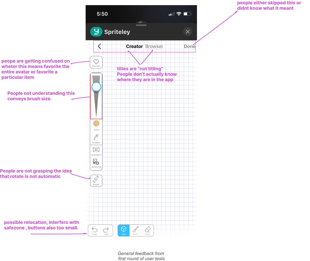
I did about 7 interviews in which I simply asked people to describe what they thought each button did on the screen. We got pretty bad results. So it was back to the drawing board.
The most common editing tool people brought up during my interviews was the instagram edit feature. So i did my best to pull from that layout. During this transition I also began to use more iOS design system components, and I created buttons that would make sense in that design system.
Additionally, I tried to create more focused screens by breaking up tools into navigational pop over elements, rather than throwing everything on one page.

Things were already looking better. The Next big breakthrough came from using Apple Maps. A problem that still persisted were the tools still hovering around freely. A menu that could be condensed was needed. Apple’s pop up menu overlay existed in the component library our Swift developer was using so it was just a matter of organizing.

Automatic rotation and pan
Rotate becomes an "invisible" tool
In order to pan/rotate this switch had to be in the active position. People weren’t familiar with this function, they simply wanted the mesh they were editing to auto-recognize the area they were trying to effect. During tests someone brought up how Minecraft can recognize the differences in these taps.
The solution was quite simple when blank space is being effected pan, when the mesh is being effected tool always takes priority.
The solution was quite simple when blank space is being effected pan, when the mesh is being effected tool always takes priority.

Preparing for production
Building a design system
At this point we were ready to release the production version so i began refreshing the buttons. I kept things as minimalistic as possible.
I noticed how many creator tools, stayed in states of black and white. I continued that trend after getting good feedback from testers.
Square buttons were set for navigational elements and round buttons as options within states. Titles were given to pop over screens.
I noticed how many creator tools, stayed in states of black and white. I continued that trend after getting good feedback from testers.
Square buttons were set for navigational elements and round buttons as options within states. Titles were given to pop over screens.

My reflections
Final Designs

After designing the main tool dashboard all other design decisions fell nicely into place. Overall I was quite proud of this design and so happy when even children were able to pick up the app and start building.
Overall, the key thing I learned from this sprint was that a "good design" is a better focus starting out, than A original design. Using what exists instead of reinventing the wheel.
Overall, the key thing I learned from this sprint was that a "good design" is a better focus starting out, than A original design. Using what exists instead of reinventing the wheel.


