
The Q
Streamlining Audience Song Requests
During A Pandemic
During A Pandemic
iOS - 2020

Role :
Lead Designer
Tools :
Figma, Miro, Otter.ai
Duration :
3 months
The Q is an iOS app built for music events, that allows audience members the ability to request and vote on what gets played next. I was brought onboard to research and create the core song request flow.
The challenge
POV You Are Now A DJ
You are a DJ in the middle of a gig. The music is loud. The room is dark. You are constantly switching your focus between reading audience reactions, the next mix on your screen, and visual cues from your host. While all of this is happening, someone from the audience walks up to you. You hear the word “request” over the music playing. You try to lip read to get a song title or an artist name. After a few awkward exchanges, while leaning over your setup, you finally understand and play the requested song, only to find out from the audience's reaction that no one wanted to hear it in the first place.
Now I want you to think about that entire scenario, but now put a mask on everyone's face.
Challenge: How might we automate the request process for DJs?
Now I want you to think about that entire scenario, but now put a mask on everyone's face.
Challenge: How might we automate the request process for DJs?
Interviews
Empathizing with DJs
My research began after discovering that
- DJs have trouble hearing and finding requested song titles.
- DJs often miss the mark on whether the song fits the audience vibe at the time.
These problems lead me to reach out to a few DJs to get further input. I put up a post on Reddit which asked how DJs take requests at their gigs with a survey. The conversations that I had with DJs in the comments section led to five interviews. These DJs from across the US validated these key insights.
INTERVIEW INSIGHT #1
My real competition is pen and paper
75% of DJs mentioned that they take requests via a clipboard next to their set up.
INTERVIEW INSIGHT #2
Other apps exist
However, audience members are hesitant to use them if the experience doesn't immediately click.
INTERVIEW INSIGHT #3
Spotify is part of a DJ's setup
DJs will often use Spotify to queue a song that's not a part of their local library.
Competitive Analysis
Competitors don’t live up
My DJ interviews revealed that if applications aren’t easy enough to use immediately, audiences simply won’t use them. My next move was surveying a group of people who regularly attend live events. I let them use some existing products and listened to their feedback. I noticed a lot of similar problems across the board.

Confusing layout
“I don’t know how to request a new song." - Andrea
Screens need to be focused on the key actions that move the user along.

No voting
“without voting this is just the notes app.” - Chris
If a clipboard and pencil can do the same things as the app, the app shouldn’t exist.

Forms suck!
“Why do i have to give them my email address ?” - Ted
Sending a request should be a effortless process. With as little typing as possible.
Ideation
Frankenstein a solution
I began to explore my ideas for the request flow by sketching some early iterations and elements.

These problems lead me to reach out to a few DJs to get further input. I put up a post on Reddit which asked how DJs take requests at their gigs with a survey. The conversations that I had with DJs in the comments section led to five interviews. These DJs from across the US validated these key insights.
A tab for requested songs & played songs :

A way to submit a new request :

A way to upvote & downvote song requests :

Song info and album artwork :

For documentation purposes, I like to break down the sketches I make and try to figure out where the influence comes from. I screencap the features or take pictures of things that I want in my product and put them together. What ends up happening is a Frankenstein collage of ideas.
Ideation screen

Building the Prototype
Crowdsourcing an interface
I began mapping the product flow out around how an attendee would navigate the event page.

I listed out all the actions a user can do on a single screen. For each action, I created problem statements and their answers.
As an attendee, I want to :
As an attendee, I want to :
PROBLEM STATEMENT #1
Submit a song request to the DJ
Therefore, there needs to be a clear flow for requesting a song with as few steps as possible.
PROBLEM STATEMENT #2
Help the DJ decide what to play next
Therefore, guests need the ability to see open requests and freely vote on tracks they'd like to hear.
PROBLEM STATEMENT #3
See if my request was taken
Therefore, there needs to be a history tab for played songs or some form of acknowledgment.
Based on these solutions, I started iterating on the main event page. I broke down the page into three blocks: Event details, new request button, and existing track/voting. After many iterations, I focused my attention on the best three designs for each block. With a sample size of 25, I QA tested them.
This section was a text hierarchy problem and had to be instantly scannable.
I asked people which layout they liked the most.
This section was a text hierarchy problem and had to be instantly scannable.
I asked people which layout they liked the most.
Event details :

New request button :
Requesting a song is the main action. It had to be in clear view near the top. If placed above the details section, attendees might not read the details and request a song that can’t be played in the first place.
During this test, I asked people to request a song. I timed how long it took people to locate the correct button. However, each button delivered similar results. Once a tester knew where to look, the version of the button didn’t matter. I moved forward with the search bar because attendees felt like it made the most sense in context with the album covers.
During this test, I asked people to request a song. I timed how long it took people to locate the correct button. However, each button delivered similar results. Once a tester knew where to look, the version of the button didn’t matter. I moved forward with the search bar because attendees felt like it made the most sense in context with the album covers.

Existing track requests and voting :
I pictured this as a long scrolling list. This section ended up being at the bottom of the screen. Similar to the event details test, I asked testers what layout they liked the most.

Once testing was complete, I assembled and refined the top-rated elements into one screen.
Main low fidelity screen :

Usability Testing
Where are users tapping?
I did my 1st round of usability tests with the event screen as a whole. My intentions were to see where people’s mind’s drew them to first. What were they tapping? Why were they tapping? How fast are they tapping? Each test was about 5 mins. Users were recorded and asked to narrate their process.
Each tester was instructed to go through the demo, request a song and then vote on someone else’s request.
Each tester was instructed to go through the demo, request a song and then vote on someone else’s request.
LOFI wireframe presentation :
Testing revealed critical flaws in my designs. The biggest takeaway was the fact that people weren't as familiar with the upvoting and downvoting mechanic as I had thought. I found out that if you are not a daily Reddit user the concept of upvotes and downvotes is pretty foreign. Besides this I just had to deal with a few cosmetic challenges to signify active states.
Changes
Necessary revisions
I began to convert my foundation into a deliverable product. My stakeholders gave me a color palette and I worked within those parameters to begin giving my prototype some fidelity. Creating buttons and coloring in the lines was lightwork. What was most important in this phase was combating the issues I observed from my usability test. Those being:
Requesting a song :
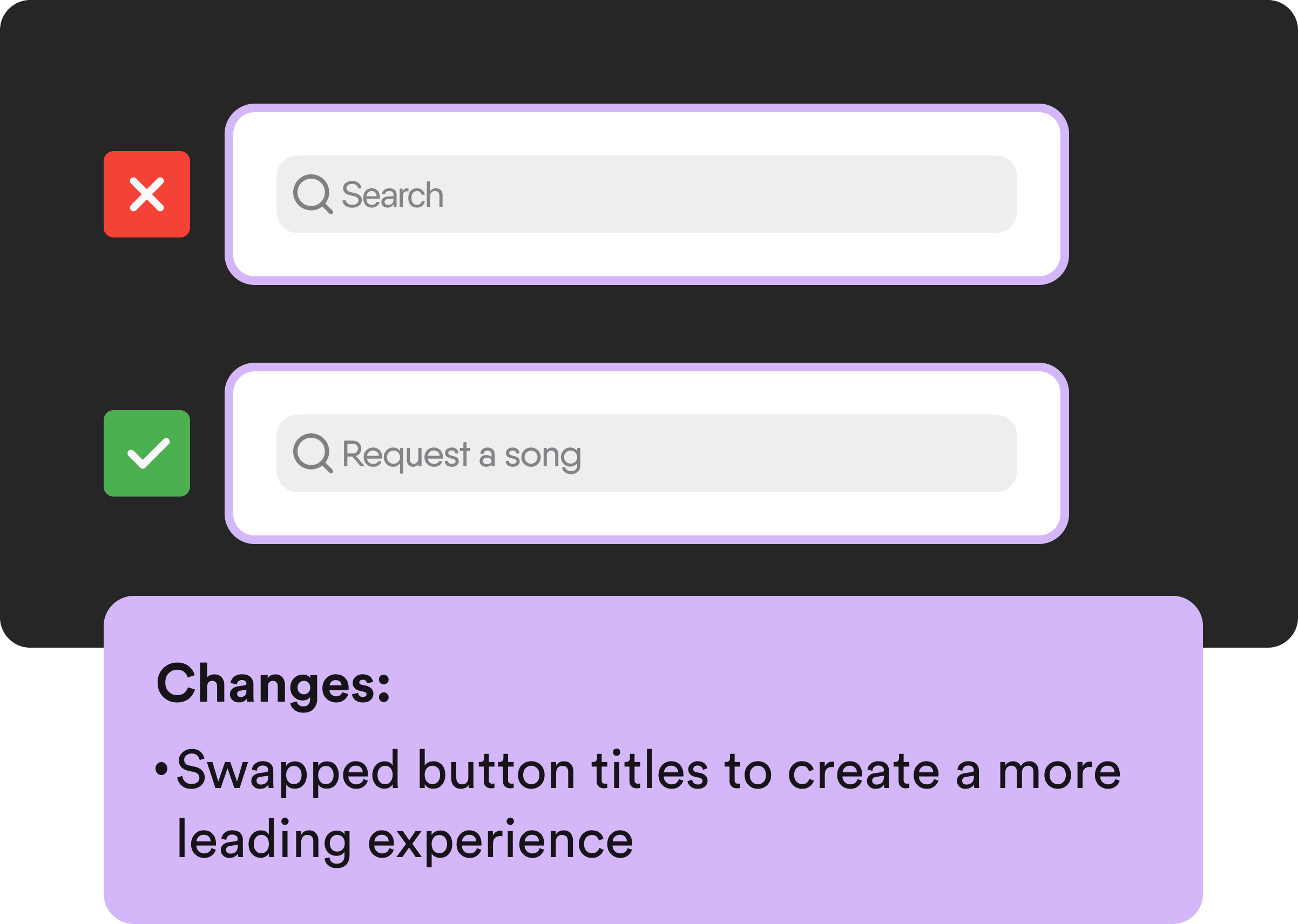
The original search bar tested the best. However, in context with the rest of the screen, the title 'Search' confused people. The solution here was stupid obvious. I just for whatever reason completely overlooked it with my LOFI model. I just swapped the title to 'Request a song' instead of 'Search'.
Voting and track layout :

The original up/down voting button didn’t immediately click with testers. So I went back to the drawing board with this button. Many testers mentioned that they were more familiar with the like button found on platforms like Instagram and Twitter. I followed through with that as a change after affirming it in a quick survey. Those who completed the QA test on a phone complained about reaching their thumbs to hit the vote button. After some quick googling, I learned that 90% of people are right-handed. I felt this was more than enough of a reason to follow through with the button placement change. All buttons that previously were on the left were shifted to the right. After solving all of the kinks I organized my design system and went through one last round of testing.

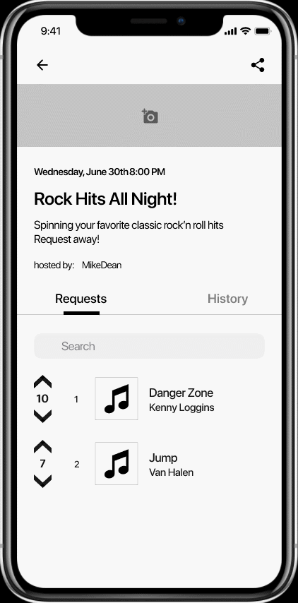
Final Product
The song request flow realized
Requesting a song:

Audience members are greeted with a search bar that enables them to request a song. As the search flow begins recommendations appear based on played songs found on the setlist tab. When they have found a song they want to request, all they have to do is hit the plus button and a checkmark confirms the submission.
Requests tab:

Active requests shows all songs that have been requested by audience members in order of popularity. Audience members decide what gets played next by liking each other's requests.
History tab:

The History tab shows requests that the DJ has accepted.
Reflecting
Personal takeaways
After delivering my design system and wireframe, my time with this project was over. Though my clients wanted me to continue working on this project, I had other commitments that conflicted. If I had chosen to continue with this project, I would have worked on the event creators flow of the app. This would have included an event creation flow, and a event screen with extra admin powers (removing songs, moving songs to history tab, and Spotify interconnectivity).
This was the first project I worked on where I couldn’t immediately empathize with the primary user. I’m not a DJ. I don’t have DJ problems, I had to learn about a whole profession and really breakdown core issues. There were times before my interviews where I was coming up with scenarios and features that I thought DJs wanted. Almost all of the scenarios were proven irrelevant once I talked to a real DJ for 10 minutes. As cliché as it sounds, this project reminded me that I’m not designing for myself, but for the user.
The biggest lesson I learned with this project was how detrimental a poorly labeled button can be. Accessibility begins with making your language as clear as possible.
Overall, I am proud to have worked on this project and wish the team only the best.

